Tuesday, December 25, 2007

Doors

If you have any pictures of beautiful old doors -pre 1940- I'd love to see them.


Isn’t this charming with the work boots resting on the doorsill? I wonder about this dark burgandy trim. I do really like the overall effect but want to see what it would look like not as dark and maybe painted all the way around each panel.


Here’s the Gothic arch which is echoed in the porch opening. The door trim, painted a different color, sure highlights the shape of the arch.


Charming! I love this one. It’s white on white while the white stucco has just a hint of grey in it so the white wood stands out proud of it.


These doors are from townhouses by Kitsilano Beach in Vancouver. It’s the ivies growing around the archway and the doors set way back that make this a grand entrance. The lights/windows would be better in a round top and not an eyebrow but who’s going to notice?


An indoor door, likely solid core which you’d never find anymore. I like the planked look and love the treatment of the top trim board.


Imagine the time it took to frame in the rough opening on the door and the round top roof. It’s beautiful and it’s too bad few spend the time or money to do this kind of work today.


This door needs work. The house needs work. The red trim on the door looks like painter’s tape around the window.


Here’s another project. Looks like San Francisco. The transom over the doors and the pillars sure heighten the entrance. The colors are very subtle and I’d love to see a punch of a bold color like a maroon, perhaps on the doors themselves while keeping the door panels subtle.


It’s natural wood and not painted. Not that typical for a true Craftsman house in this decade. Over the many years I expect most doors have been painted a few times. This window appears to be stained glass and likely glows when there’s a light on inside.


Barn doors. Imagine them with tall brackets, hinges and handles. Imagine them with painted panels, with glass at the top. There’s a lot that could be done.


Barn/murphy door on the San Francisco docks. If one was to copy these doors, the ribbing would have to be pronounced enough to create the dark shadows seen here. I do wonder how these would look with the doorway trimmed with black.


This door isn’t so old but it’s charming, and what makes it charming is, the eyebrow arch in the door is echoed in the porch opening. The big panel on the door works only because the mail slot becomes the focal point on such a big space.


The door itself is interesting with its big sturdy vertical planks. The little window and hardware break up the space. What it really needs though is, the door trim to be more pronounced, perhaps a thin black line on the inside of the trim. Also a big black escutcheon plate or a much bigger door pull would help, and big black hinges would certainly strengthen the look.


As inviting as this one is with the mullioned sidelights, their pronounced sills, the proportion of the window in the door, there’s something that could strengthen the look. There’s a block of space below each sidelight that could be filled with a bushy potted plant, something about 30” high and 20” wide.


Craftsman door. Note the window sill and mail slot.


This is from a heritage home tour in New Westminster, B.C. and I expect that’s a volunteer inside the door. Screen doors like this are not hard to find nowadays, but look at those sidelights/panels. They really announce the door.


This house was fenced off so I was unable to get more of the door. It’s beautiful though with the little stained glass sidelights, big wrought iron hardware and the wood detailing framing the opening.


This looks like a wide door, which calls for rethinking of the proportions. This may be why the window is gridded and not sectioned such as in #3 or #15. The white on white shows off texture beautifully if one is close enough to see the shadows. It’s charming, inviting and cottage-like.


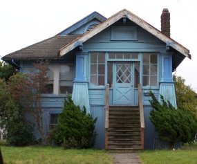
Note how the three windows frame in the door. There’s a diamond window in a round panel at the top of the door and a mail slot at the bottom.


This door certainly defines the property. Everyone likely knows this house as the one with the yellow door. There’s a strip of white between the door and the trim. I expect the effect would be better, stronger, if it was painted in a thin strip of charcoal.

Wednesday, October 24, 2007

Heritage Home Tour -Vancouver

This style is prominent in the Kerrisdale neighborhood of Vancouver yet the local builders don’t seem to have a name for it. It’s a blend of Tudor and Eastern cottage and was popular in the 1930’s. The book British Columbia Houses calls it Western Gothic or Eastern Builder. I call it 'Kerrisdale style' because it has a strong presence in that neighborhood. Another name might be, -and I say this with a snicker- ‘tudor-lite’.

Features to look at:

#1. Splayed legs on porch, awnings (houses face west and gets the evening sun), big asphalt roof shingles. There are brackets below each window that once supported painted wood planters as in picture #17. These sunshine colors are not at all typical of this style yet they are very well presented. I can’t help but smile when I see this house.


#2. The shed dormer is often centered in the roof space as it is here, but sometimes it’s attached to the projecting gable as in #3. Note the shallow pitch along with the steep pitch.


#3. Note the lack of fascia, the gable in gable, the shed dormer (this one is unusual being that the wall has very little width and there is no window on its front face). The porch has the punch with its strong blue door flanked by tiny roundtop windows.


#4. This one leans toward cottage style. It looks very comfortable, and quiet, in its setting likely because of the natural colors. Imagine it in brick red and it becomes stately. Imagine it with a walkway coming towards you with a low trimmed hedge on each side. There’s a lot one can do with this house to change its ‘mood’.


#5. Note the bay window with witches cap. Looking closely I see that those black lines below it is wrought iron –I’m not sure why it’s here. The picture window needs to be stronger, perhaps with an awning of some color, or black shutters, or a black trim around the white window trim, or perhaps it would present itself better with a clear view to the front door.


#6. These gables are side by side. I wonder about water runoff and if a height restriction kept them from being one inside the other such as in #7. Note the painted half timbers and the oval vent. These windows are typical of this style although the shutters are not.


#7. This one is more modern, not as tall looking –it’s boxier. The roof pitch is reduced. Note the gable in gable, the square vent, and a small feature (another vent) at the very top of the top gable.


#8. This one is almost a Tudor, definitely a tudor-lite. Note the projected gable on brackets, how the gables ‘bottom out’, the outline of the entrance, the grid in the windows, the tiny diamond shape in the gable and the thin black trim around the white window trim.


#9. Here we have the steep gables, a shed dormer, a shallow curved doorway and window. Note the way the verge board ends hiding the gutters.


#10. This is the doorway of #11. Up close it’s beautiful –white on white reads as rich texture- but from a distance it disappears. Note the shingle shapes, the painted half timbers, the round top door with strong vertical lines, even in door hardware, and the squared off verge board ends.


#11. Here’s another gable ‘beside’ gable, although the gable ‘in’ gable is more prominent in this style. Note the steep roofs, the mini window with its own roof and railing. The garage wing looks like an afterthought, maybe an addition. Imagine if the front door trim was white with a 1” strip of charcoal grey along it. That would really pop it out. Imagine potted plants, something big and bold on each side of the top step. Zing!

#12. This is a rare example of one that isn’t stucco. It looks to be asbestos shingles, which are harmless as long as the asbestos isn’t exposed, opened. Note how one wall face comes down further than the other. The bay window looks weak and could be strengthened with a 1” black line under the sill. That would pop it out and give the face a focal point, and better balance.


#13. Color! Look at how the wood details draw attention to themselves with the strong color contrast. Note the 2x2 windows in the attic over the 3x1 windows. The prominent bay window has a suggestion of a roof deck above. There is a window box with flat roof below each 2x2 window as if to underline the upper floor. The windows are true divided light. If one was to have wood windows and trim custom made, this would be an excellent prototype.


#14. This is an interesting approach to Kerrisdale style. It’s very symmetrical but the chimney takes away from it. Center window needs to be stronger, bigger, or in a defined grouping. Maybe a curved roof over door as in #17 would help. The eye needs a focal point here, a place for the eye to rest.


#15. Here we have the roof edgef rolled over the fascia. Note the arched windows and vent, the gable next to the gable –how does water run off? And the position of the gable dormer.


#16. This is an example of how the prominent wall face extends beyond the house into the sideyard inviting the visitor in while providing some mystery, some privacy. It’s too bad many city bylaws no longer allow for this projection into the sideyard.


#17. Love the detailing on this one! The curved roof establishes a focal point. Note the black trim around the white window, the brackets on the jerkinhead gable, the planter box (the painted triangles are typical of these planters, this style). There is some wrought iron that runs vertically and looks to support the curved roof. Excellent use of no colors! The white is set off from the off-white stucco simply by defining it with a thin black outline.


#18. Wow! What color! The front door is almost an orange, the complement of blue. That’s what makes this work so well. Note the painted half-timbers, the windows, and the steep gable positioned well forward of the back gable. Note how the upper floor comes forward further than the main floor creating a shadow -underlining it. Very strong presence. Five stars for this one.


Summary of Defining Features:

-Roofs: usually very steep, always strong gable perpendicular to side to side gable, often shed or gable dormers. Asphalt shingles are big and black.
-Porches: usually small front stoop with a corbelled wood trim around opening, arch is rounded or with a slight gothic point as shown here, often has door painted in a bold color.
-There are strong vertical elements in the windows and vents which are centered under gable face.
-There usually 1 or 1-1/2 stories with a suggestion of half timbers, painted but not stained brown as they would be in Tudor.
-Texture: Texture is big. Stucco is coarse and half timbers project ¾” forward of the stucco and that provides a shadow.
-Main floor is often about 30” above grade with 1 ½ person wide steps painted in a somewhat contrasting color. (#2 steps should be darker).

____________________________________________________

There you have a sampling of the style found in the Kerrisdale neighborhood of Vancouver. Enjoy and I'll be posting next week with another sampling -of what I'm not sure yet.